Design system redesign + Platform refresh
Redesigning the MindBeacon design system and refreshing the UI with 4 key goals in mind:
- Renewing our brand identity
- Driving customer interest
- Improving usability through small improvements
- Streamlining the design to developer hand-off.
COMPANY
MindBeacon Health
ROLE
Senior Product designer
YEARS
2021 – 2022
My role
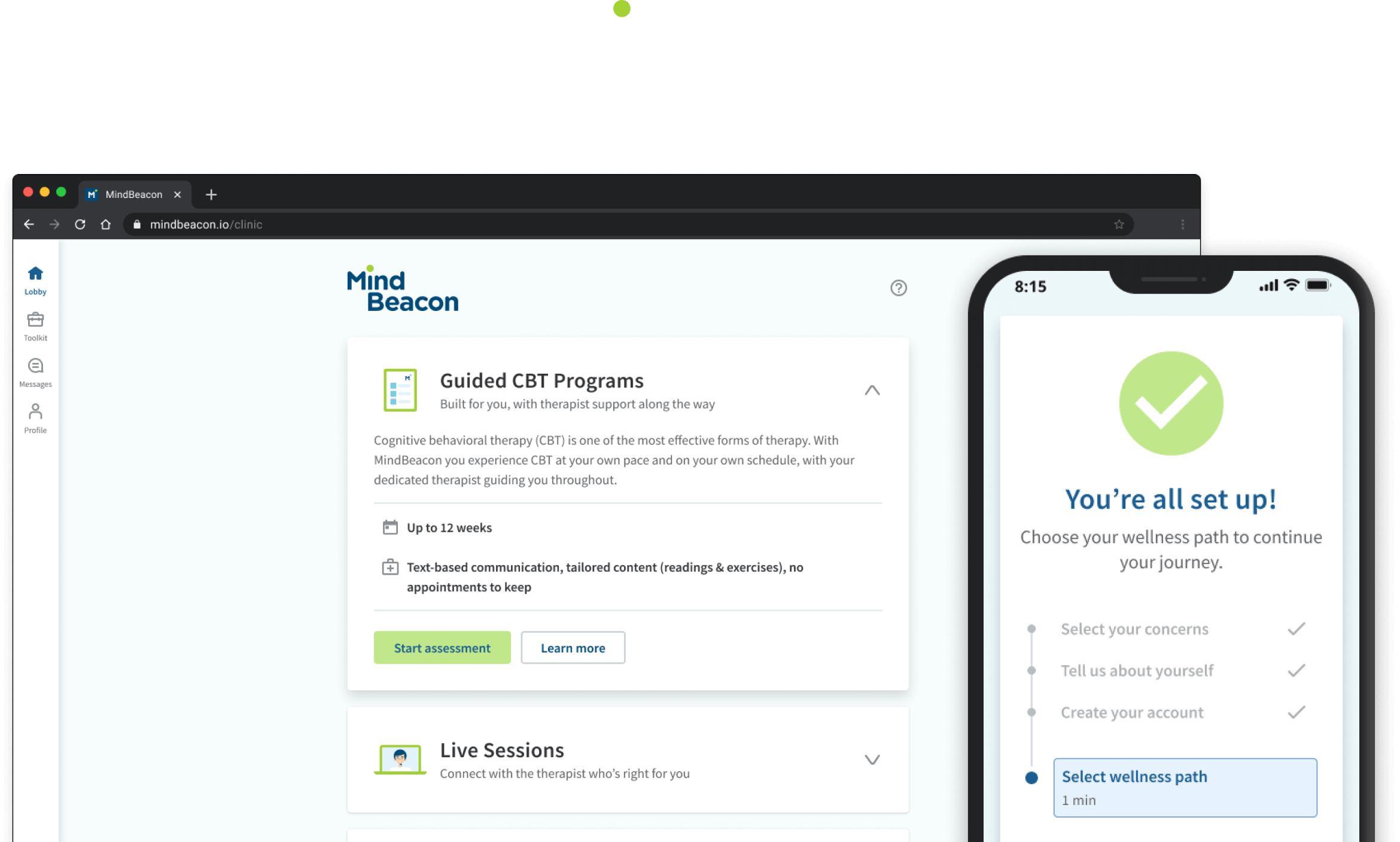
Having created and contributed to multiple design systems in the past, I was tasked with leading the design system redesign and platform refresh for MindBeacon. Working closely with the PM and Platform Engineering Lead, we came up with an approach that would allow us to make the biggest impact while still utilizing the engineering team's time effectively, as we were working with limited time and resources.
I worked collaboratively with the director of UX Research to ensure that the design system components created could also easily be used in the onboarding efforts that were being worked on in parallel with this project. Delivering flexible components and documenting guidelines and principles which could be used across the platform.
The problem
The existing look and feel of the platform UI was very dated and inconsistent, resulting in a poor and fragmented experience for our clients. By creating a more modern and streamlined platform based around a single design language, we could create a more consistent experience that drives interest in the product.
We also wanted to address concerns that were raised regarding the design-to-development hand-off. Our previous design system was monolithic, unintuitive, and inflexible which made it time consuming to create experiences quickly across web and mobile. Furthermore, the various principles, guidelines and component specifications were spread across multiple platforms such as Figma, Zeroheight and Storybook.
UX outcomes
To help guide our progress and give ourselves a sense of what success looks like, we came up with a number of UX outcomes.
We believed that if we did a great job refreshing the platform experience, by redesigning the design system that...
- Designers will feel more confident that they are creating cohesive experiences across the platform
- Developers will better understand how the platform experience should work when developing
- And clients will better understand our product offering, feel more confident that we can meet their needs, and tell others about their positive experiences. We’ll achieve this through a consistent experience with improved usability and accessibility.
Success metrics
We defined some high-level success metrics, including:
- SUS (System usability scale)
- CSAT (Customer Satisfaction)
- NPS (Net promoter score)
- Reduction in UX related support tickets
We also wanted to track internally that we were reducing time to delivery and the number of changes to the experience after development has started.
Discovery
We knew from the start that we didn’t have the time or resources to do a full redesign of the client experience. We also needed to be agile to keep aligned with the ongoing onboarding work being done. We decided to focus on just enough research to get us through phase 1, setting a foundation that we could build upon in future iterations.
Brand alignment
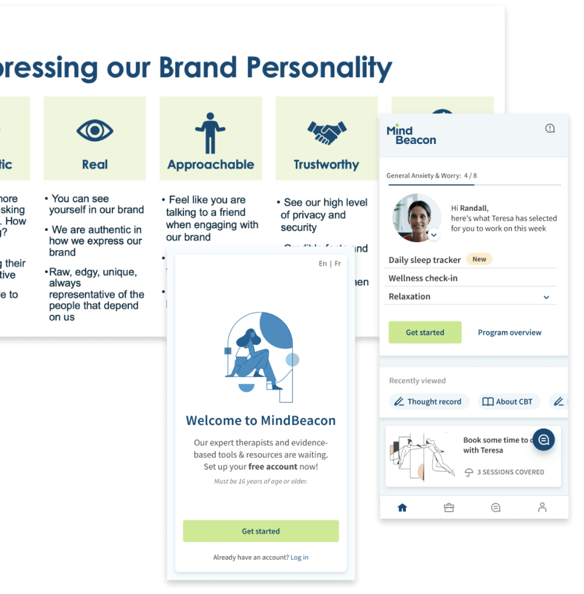
I started by aligning our foundational design elements with the MindBeacon brand improvements being worked on by the marketing/content team which meant:
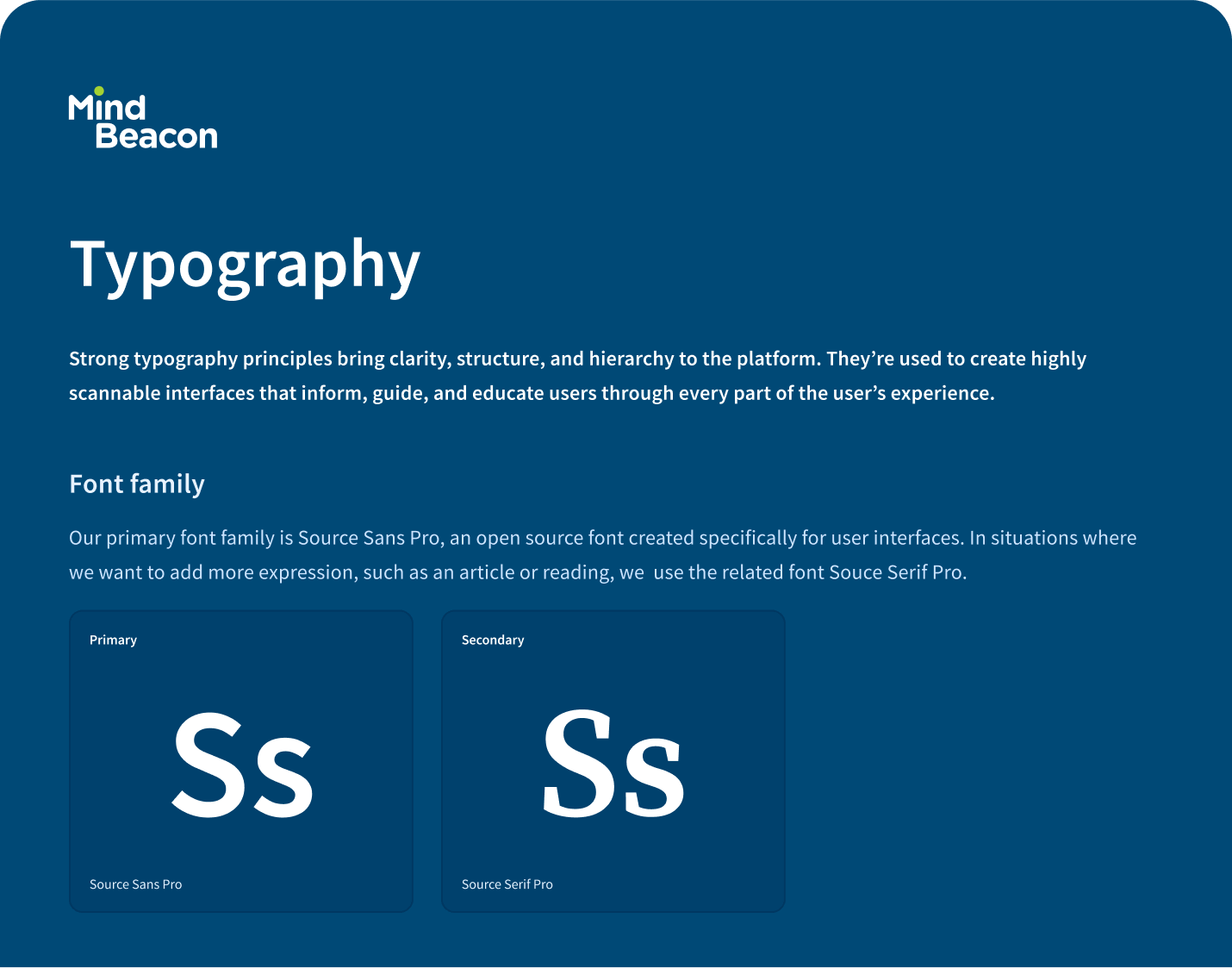
- Updating our Foundational elements (Colour, Typography, depth, etc.)
- Creating consistent layout guidelines
- Assembling a library of illustrations (For the sake of speed and consistency we opted for using an open-source illustration library).
Platform audit
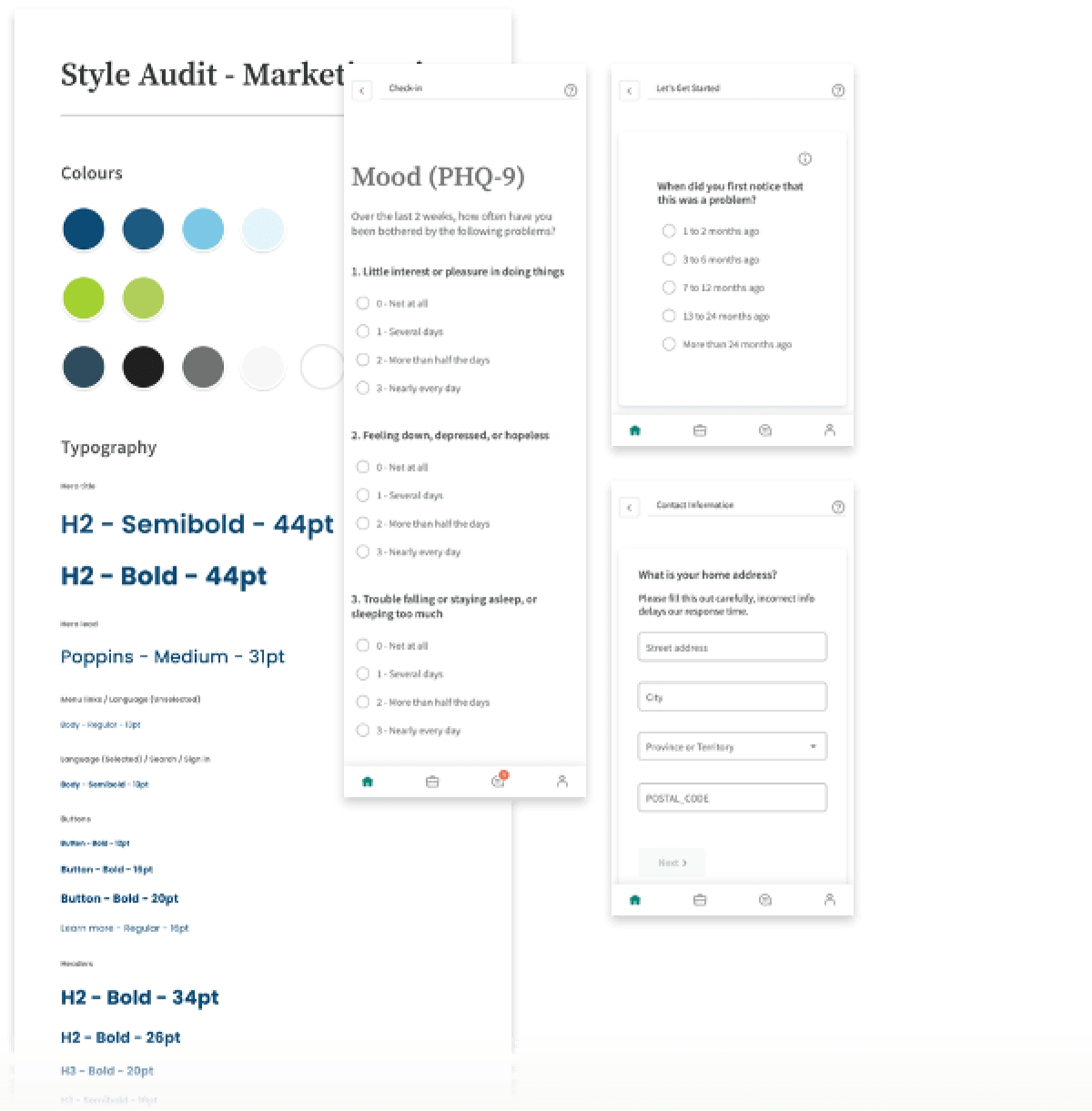
I conducted a full audit of the platform to get a better understanding of the most commonly used components, patterns, and page templates. I took screenshots as I went and started grouping the pages into common layouts.
We noticed that some of the most common layouts across the platform were:
- Product pages
- Intro pages
- Content pages, such as articles
Figma audit
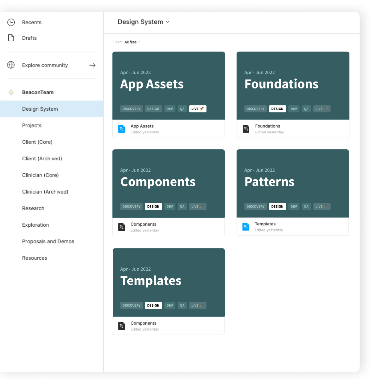
Having flexible components and templates are all well and good, but if you can’t find what you’re looking for it's going to drastically reduce the effectiveness of the work. From my first day at MindBeacon, I had struggled to make sense of our file structure in Figma, and found it hard to know which files were the most up-to-date and if the work was in progress or live.
Unlike Marie Kondo, I don’t like mess.
I took the opportunity to bring rhyme and reason to the system, creating a proposed file structure that would allow us to more quickly find up-to-date designs, provide us with more guidance, and allow for more intuitive structure for our design assets.
Accessibility and typography audit
As a mental health platform used by a broad range of users, it was important to ensure that we were meeting the SLA (Service level agreements) laid out by our various contracts, which required us to be AA compliant.
I ensured that our foundational elements met AA compliance for our design system, refreshed my knowledge of WCAG accessibility guidelines, and did preliminary research into semantic heading structures. I also wanted to understand to what extent the platform was usable by users relying on screen readers.
Improving collaboration
through storybook
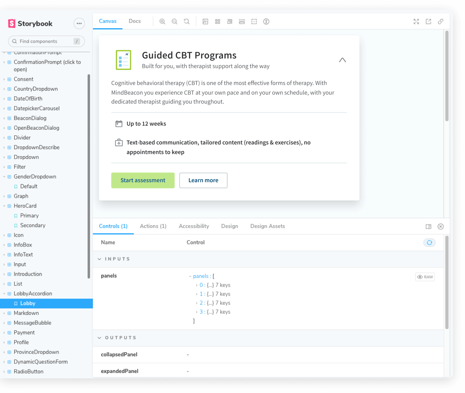
Working in tandem with the PM and Platform Engineering Lead, I came up with a proposed structure for creating more collaboration between engineering and design using Storybook as our central source of truth.
Outcomes
Template layouts
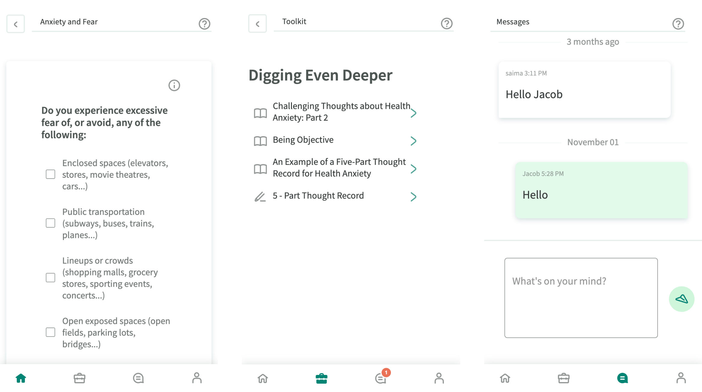
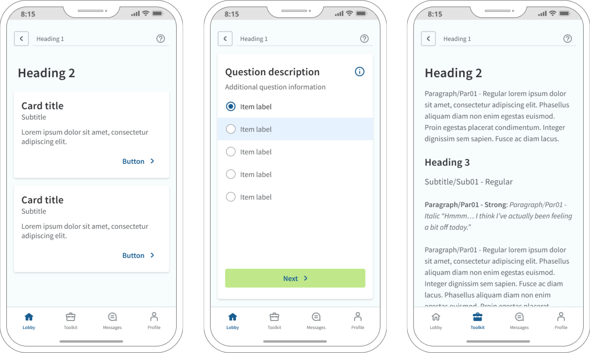
I created template layouts for all of our core pages to help us expedite the delivery process and to bring consistency and cohesion to the platform.
Principles and guidelines
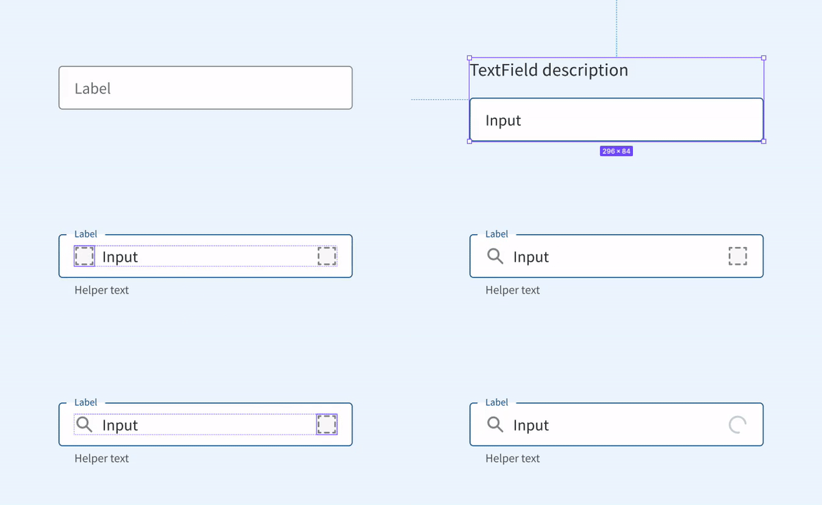
I broke down our monolithic component library into separate component pages and moved all of our design-related principles, component guidelines, redlining, and interaction notes into Figma. I kept this documentation light, knowing that our end goal was to move more of our documentation into Storybook to create a single source of truth for our design system.
Component redesign
I redesigned our core components from the ground up to be more flexible and scalable. I removed unnecessary spacers and hidden layers instead I relied on Figma variants and auto layout.
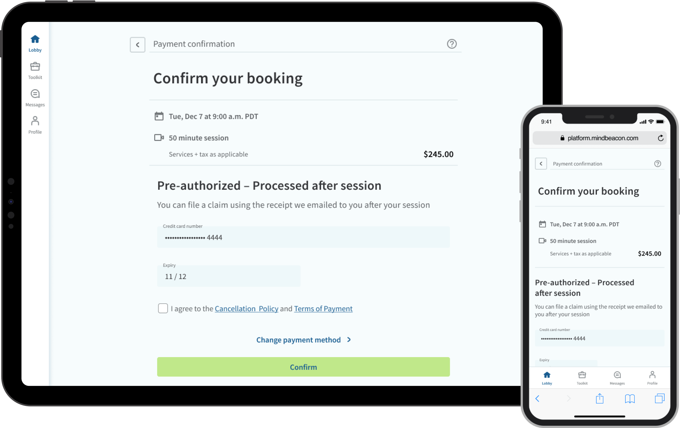
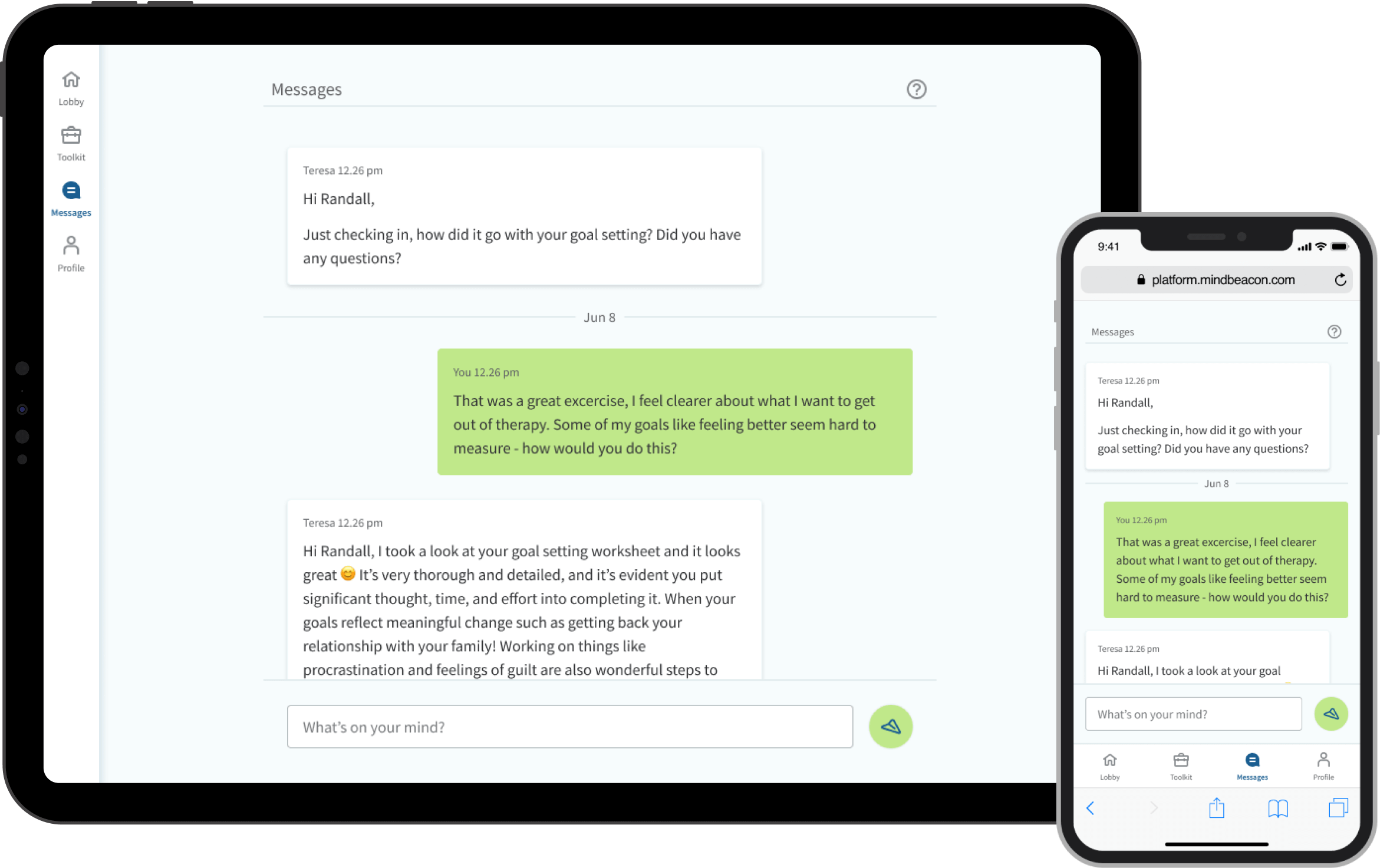
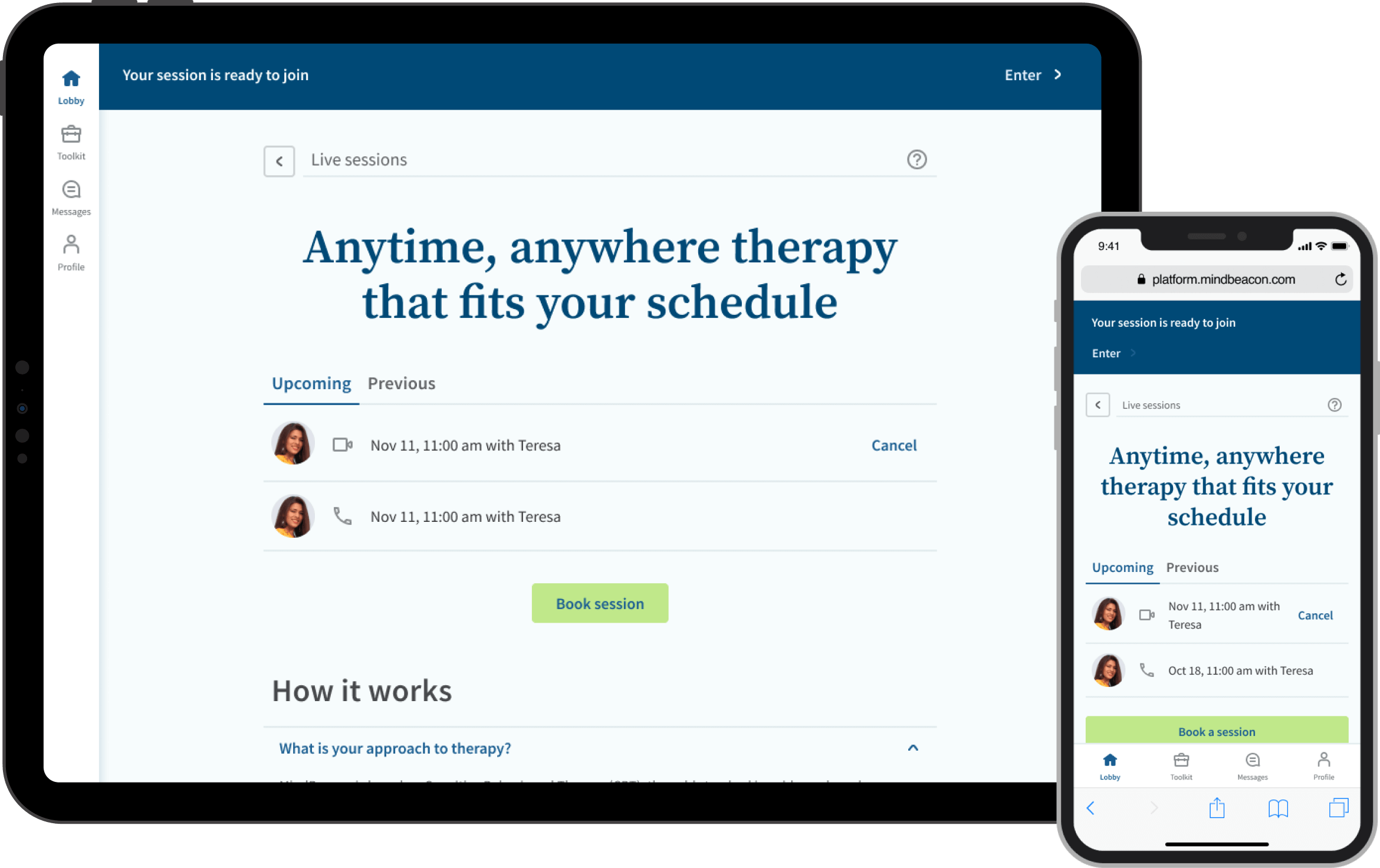
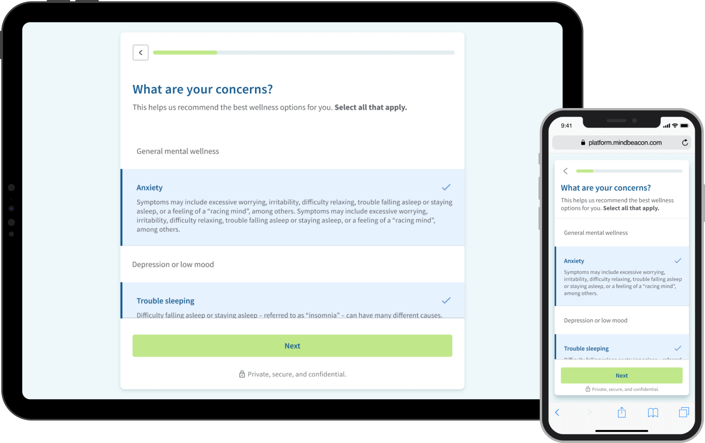
Refreshed screens
We then refreshed key screens from the platform, using our templates as a base. This made it quick and easy for us to reskin the experience to align with the brand, as well as the improved onboarding experience.
Making a negative a positive
Unfortunately shortly after finalizing and prioritizing this work, MindBeacon was acquired by a Vancouver-based Medtech company called CloudMD. CloudMD has been working with an agency by the name of Friends and Enemies on a new platform UI, and experience meant to unite its 14 acquired companies around a single brand.
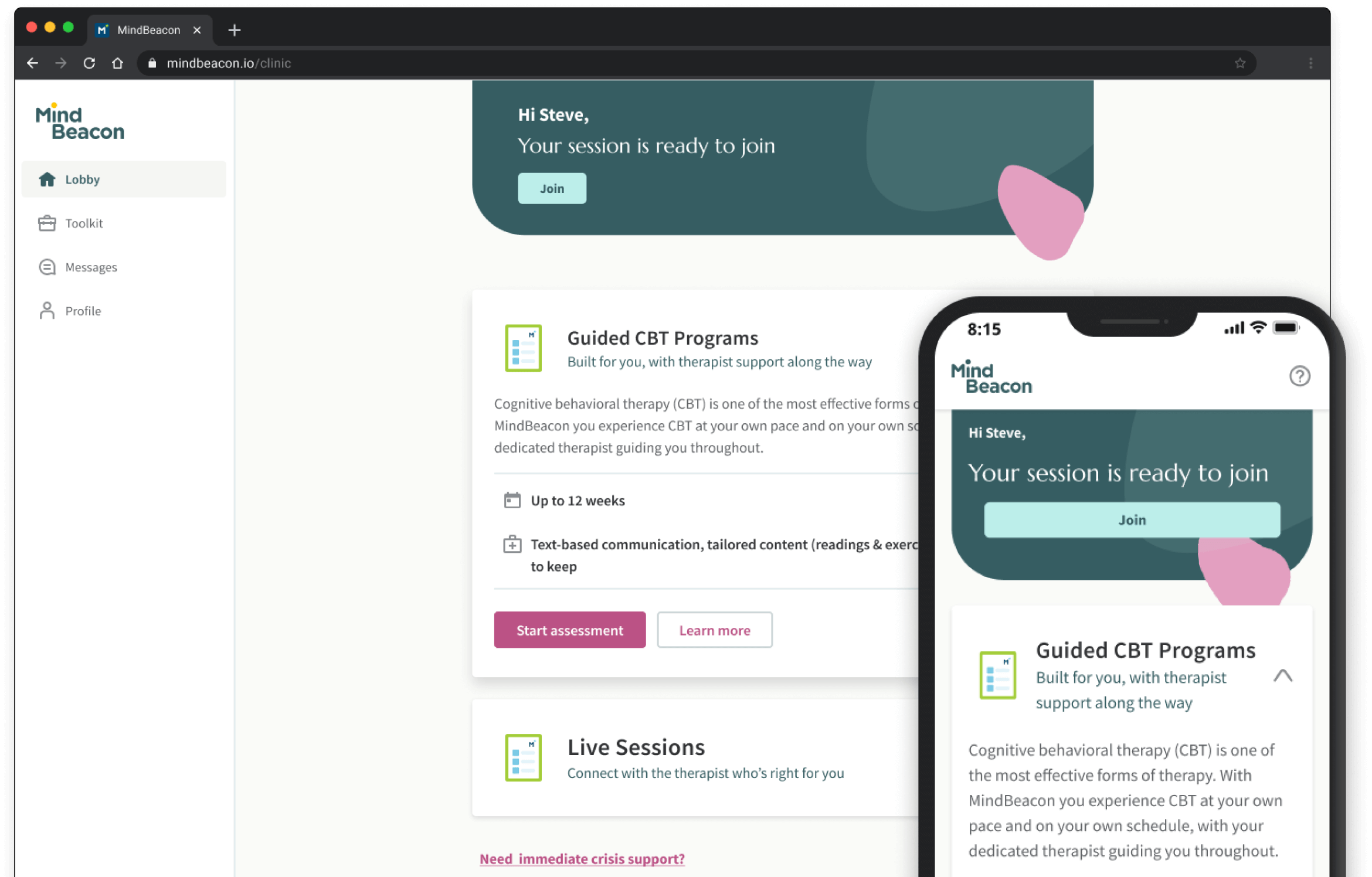
Although this has meant having to deprioritize this work, for now, the positive outcome is that the work we’ve put into refreshing the brand will allow us quickly pivot to align with the new CloudMD brand.
Next steps
- Create a Visiontype for our 2022 roadmap to allow us to envision what the platform may look like 1-2 years out. This will give us a north star that our internal teams can work against and be excited about.
- Pivot to incorporate CloudMDs styleguide into the new design system, leveraging the flexibility and foundational elements to quickly update our components, patterns and templates.
Copyright © 2020 Jake Buhrig